
THI Anniversary Merch
Research-Driven Merchandising for a University Brand
This project focused on designing a new merchandise collection for the THI shop for the university’s 30-year anniversary.
The challenge was not simply to create attractive products, but to rethink the merch offering in a way that better reflected the identity of Technische Hochschule Ingolstadt and the expectations of its students. With a project scope of only one month, the task required a structured process, clear prioritisation, and fast but well-grounded decision-making.
Within the team, I took on the leadership role early on and was responsible for structuring the process, defining the next steps, and driving the project forward. To make the limited timeframe manageable, I first established a clear timeline with regular checkpoints and team meetings. This gave the project a stable rhythm and ensured that the work remained focused and aligned despite the short schedule. My role in this project was not only organisational, but strongly directional: I shaped the research approach, led the synthesis, and translated the findings into the final concept.
The project began with an analysis of the existing THI merchandise and its presentation. Looking at the current selection, I quickly identified a mismatch between the university’s identity and the visual language of the products. THI presents itself as modern, technological, and closely connected to industry, yet much of the merchandise followed a more traditional British or American university aesthetic, relying on crests, serif-heavy typography, and a visual tone that did not fit the institution or its students. This made it clear that the project needed more than a visual refresh. It needed a research-based reconsideration of what THI merch should actually communicate and who it should be designed for.
To build that foundation, I defined three key research areas: identification with THI, students’ personal style, and practical expectations toward university merchandise. These research points were important because they moved the project away from assumptions and toward a clearer understanding of how students relate to the university, how they want to express themselves, and what role merch can realistically play in their daily lives.


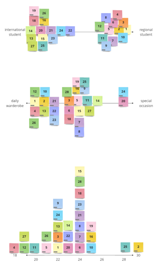
The image here shows the structure of the questionnaire and the research focus areas I defined at the beginning of the process. For me, this step was essential because user research starts long before data collection itself. It begins with deciding what needs to be understood and framing the right questions. In this project, that meant translating a broad design challenge into a set of targeted research goals that could later inform concept decisions in a meaningful way.

In total, we interviewed 40 participants, including 28 students, 10 parents, and 2 professors. This gave us not only a substantial amount of qualitative data, but also a more nuanced perspective on how THI is perceived across different stakeholder groups. The project was primarily student-focused, but including additional voices helped contextualise the university’s image beyond the student body alone.
To make the data actionable, I developed a structured synthesis process. Based on the three research areas, I defined variables along which participants could be positioned. These variables captured differences in identification with THI, preferred clothing styles, and the role merch might play in daily life. For example, participants could vary in whether they would wear university merch casually or only on special occasions, whether they felt strongly connected to the THI brand or not at all, and whether their style leaned more subtle or more expressive.
This stage shows how I translated raw interview material into a comparative framework. By mapping participants along defined variables, patterns started to emerge that would have remained hidden in the interview data alone. This process was especially important because it allowed me to move from individual responses to broader behavioural and attitudinal groups. It reflects my analytical approach to user research: I am not only interested in gathering data, but in structuring it in a way that reveals useful design direction.


Alongside this mapping, I also used tagging to summarise participants more efficiently and make recurring traits more visible across the data. Tagging helped condense complex answers into thematic markers, making it easier to compare participants and identify dominant qualities within emerging groups.
The tagging process was a key synthesis tool in this project.
It allowed me to reduce complexity without losing meaning and supported the transition from interviews to archetypes. Instead of treating each participant as an isolated case, I built a system that made similarities, differences, and repeated themes easier to recognise. This was particularly useful for turning large amounts of qualitative input into something that could directly guide concept development.
Once patterns and tags became visible, I combined them with selected quotes to make the emerging archetypes more vivid and relatable. This step helped ensure that the synthesis did not become overly abstract. The archetypes remained grounded in real voices, preferences, and attitudes rather than becoming generic user personas detached from the original material.

The synthesis ultimately resulted in three central archetypes: The Expressive, the Casual, and the International. The International archetype functioned partly as a subgroup across the others, but with stronger identification with THI and a greater need for formal or occasion-based products. This was an important distinction, especially given the large number of international students at THI and their different relationship to university identity and representation.


The final archetypes became one of the key strategic outputs of the project.
They created a shared understanding of who the merchandise should be designed for and what kinds of needs, expectations, and aesthetics needed to be addressed. Rather than designing for a vague “student target group,” I was able to define specific user perspectives and use them as a basis for later concept decisions. This was an important step in making the design process both more focused and more user-centered.
To move from user understanding into actual design guidance, I then used affinity diagramming to extract insights from the data. This allowed me to cluster observations, identify recurring themes, and formulate findings in a way that would be directly useful for concept development.

Affinity diagramming played a central role in turning the research into strategic insight. At this stage, the project moved from describing participants to understanding what their responses meant for the future merch collection. I used this method to identify meaningful themes across the interviews and to translate them into statements that could guide design choices. This reflects an important part of my process: research only becomes valuable when it is synthesised into insights that can actually inform decisions.
This image shows how individual findings were condensed into a concrete insight. These insights formed the bridge between the research and the concept phase. They made visible what the THI brand meant to students, what kinds of products and visual languages were missing, and where the strongest opportunities for the new collection lay. The shift from raw data to insight was one of the most important contributions I made in this project, because it established the rationale for every following design step.

The final insights showed that THI students generally felt proud of their university and associated it with modernity, technology, internationality, and strong industry connections. At the same time, the existing merch offering was considered too limited and visually misaligned. Students wanted both subtle, minimal options and more expressive or distinctive designs. They valued comfort, oversized fits, and products that could work in both casual and more formal contexts. The backpack already had strong appeal, while the visibility and variety of the overall collection were seen as weak points.
From these insights, I identified two major opportunity spaces in particular: one around the Casual archetype and one around the Expressive archetype. This gave the concept a clear strategic direction and helped structure the collection around distinct but complementary product worlds.

This step marks the transition from research into concept development.
By identifying opportunities rather than jumping straight to final products, I created a clearer path from user insight to design direction. It also helped keep the process focused: the goal was not to create as many ideas as possible, but to define the right spaces in which ideas would be meaningful and relevant.
With those opportunity spaces defined, the team moved into brainstorming. Here, the previous research and synthesis work provided a strong framework for ideation. Rather than generating random concepts, we were able to create ideas that already responded to specific archetypes, attitudes, and requirements.

The brainstorming phase built directly on the research and opportunity mapping and was therefore much more focused than a typical open ideation session. Because the strategic groundwork was already in place, ideas could be evaluated against real user needs and brand insights from the beginning. This is something I value strongly in concept work: good ideation is not disconnected creativity, but creativity that grows from a well-understood problem space.
The final collection translated this process into four design directions: Casual – Minimalistic, Casual – Business, Expressive – Regional, and Expressive – International.


This structure reflected the diversity of the identified target groups while still giving the collection an overall coherence. It responded to the demand for both subtle and more distinctive products, acknowledged the importance of THI’s international audience, and aligned the visual language more closely with the university’s actual image.


What makes this project especially representative of my work is the way I combined leadership, user research, and conceptual design within a very short timeframe.
I defined the process, structured the collaboration, led the research and synthesis, and ensured that the final concept remained grounded in real user perspectives rather than assumptions. At the same time, the project also allowed me to apply graphical design skills in shaping the resulting collection and visual direction.
For me, this project is a strong example of how design becomes more effective when it is built on structure, synthesis, and a clear understanding of people. Rather than treating merch as a superficial branding exercise, I approached it as a user-centered design challenge. The result was a collection concept that better reflected both the THI identity and the people it is meant to represent.